Logo & Branding | Website Design
Longview Storage
When function meets fun in a storage website redesign
Your brand and website are important touchpoints in the customer journey to show potential customers who you really are. For the rebrand and redesign of the Longview Storage website, we knew we needed to represent their cheerful personality. The Longview staff aren’t just buzzing their customers in and out of the gate – they’re a friendly bunch that go out of their way to make sure customers feel safe, happy and satisfied.
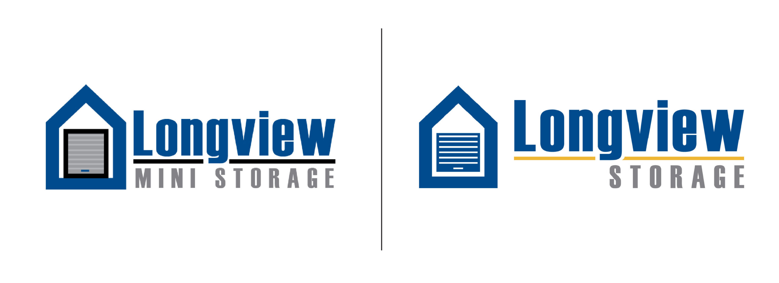
For the logo refresh, Power Creative simplified the parts and pieces of the existing logo to a cleaner, more modern mark. It’s important to us that we keep brand equity where it’s valuable during a redesign, so we kept their existing blue and added a bright accent color to complement the palette.
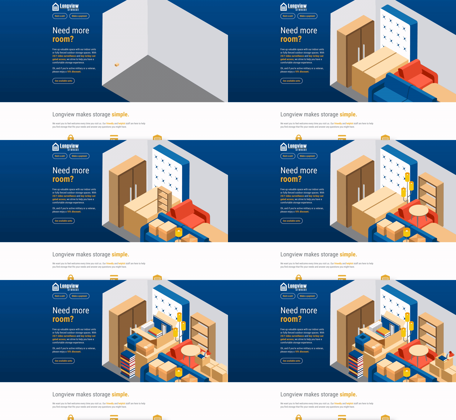
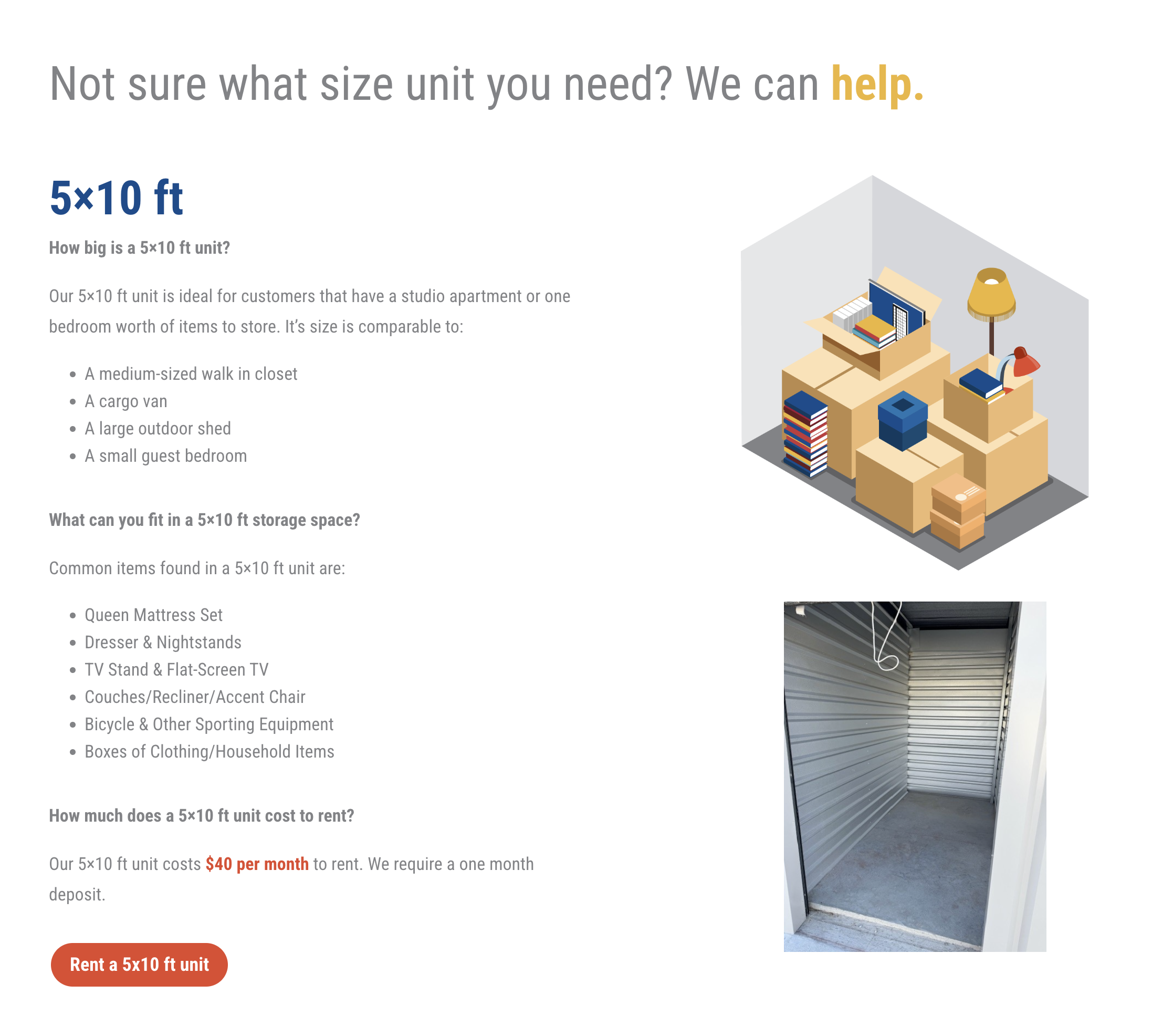
The new website is bursting with personality, from the fun animation populating with colorful storage items to the whimsical illustrations showing just how big a 10×10 unit really is. We also added a helpful size guide with examples to answer the most common question storage customers have: “What size unit should I rent?”
from the client
“After years of neglecting our website because we were busy with our “day to day,” we were introduced to Megan, Mallory and the team at Power Creative through a business networking function. What providence! While I was expecting a light refresh, some font changes, maybe a fresh picture or two, the Power Creative team gave an exciting new look to our company’s web presence!
I have always believed that we are best off doing what we know how to do and paying others to do what they know how to do. Power Creative was a terrific choice to handle this increasingly important part of our business that was certainly not in our realm of expertise. I’m looking forward to using them again in the near future for our other projects!”
✦ Debbie Douglas
Controller, Longview Storage
